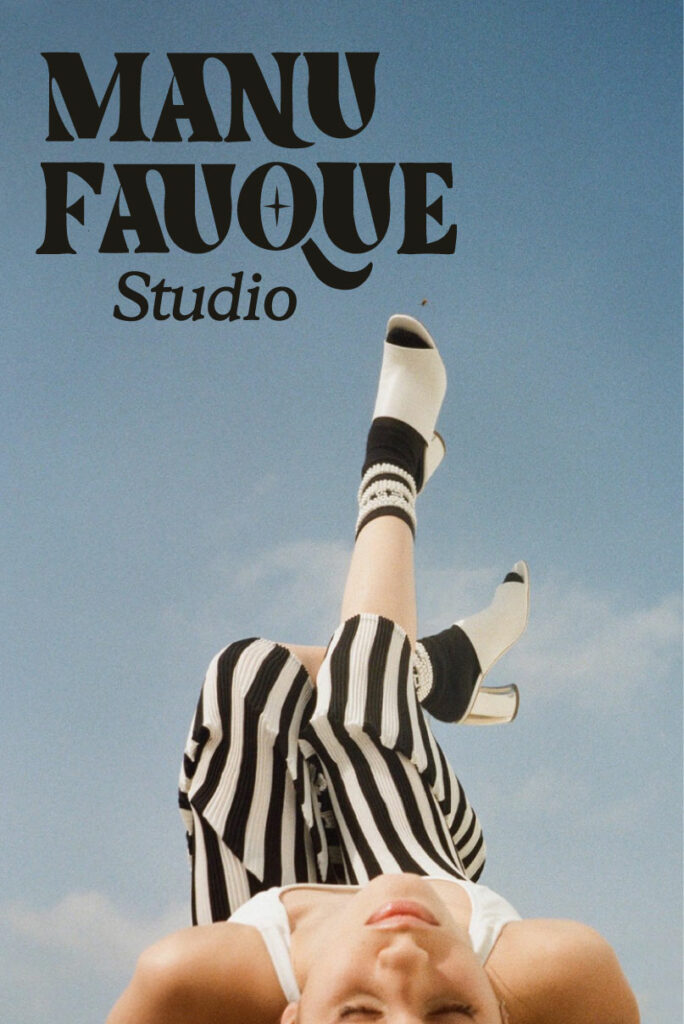
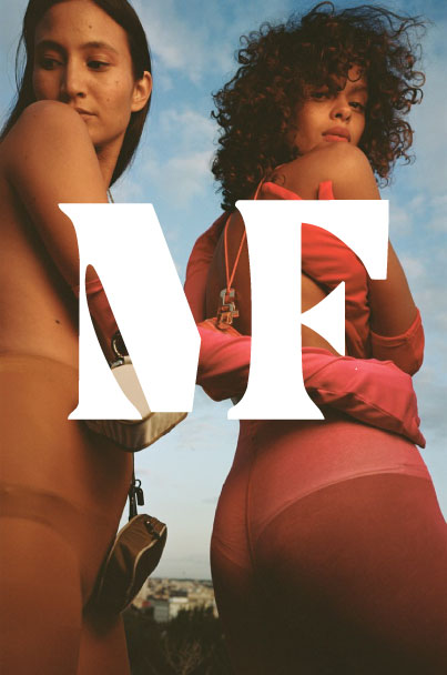
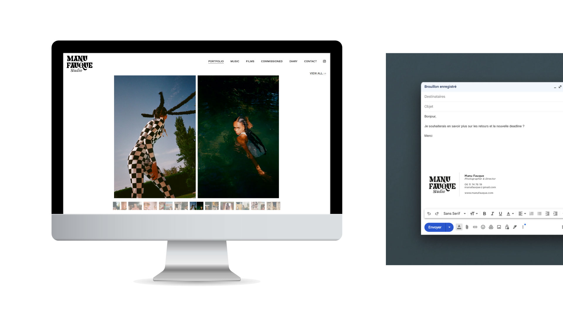
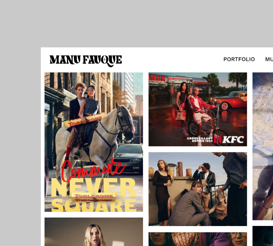
I had the pleasure of designing the new logo for photographer and filmmaker Manu Fauque. Each letter of the logotype was carefully redesigned to create a strong and unique visual identity. The typographic style combines modernity and character while embracing a true artistic dimension. The triangle formed by the “F” can be interpreted as a subtle reference to a “play” button, creating a connection with the world of moving images. The graphic detail integrated into the “O” further enhances the visual aspect of the logo, evoking both the photographer’s eye and the lens of a camera. Finally, the “Studio” wording, set in the Libre Baskerville typeface, adds a classic and elegant touch that brings balance and refinement to the overall identity. The photographs presented below are the exclusive property of Manu Fauque.